Project Goal
Create a bold, trustworthy identity for an irrigation company that feels professional, patriotic, and rooted in community.
Create a bold, trustworthy identity for an irrigation company that feels professional, patriotic, and rooted in community.
Concept
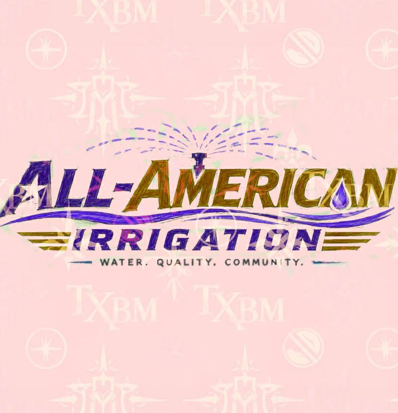
The design started with rough logo sketches exploring water movement, lawn care, and an “All-American” badge style. Early concepts focused on sprinkler arcs, stars, stripes, and strong typography to communicate reliability and pride.
The design started with rough logo sketches exploring water movement, lawn care, and an “All-American” badge style. Early concepts focused on sprinkler arcs, stars, stripes, and strong typography to communicate reliability and pride.
Design Direction
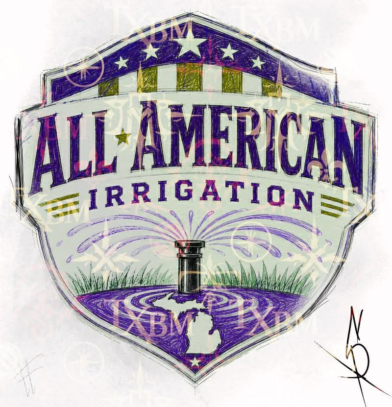
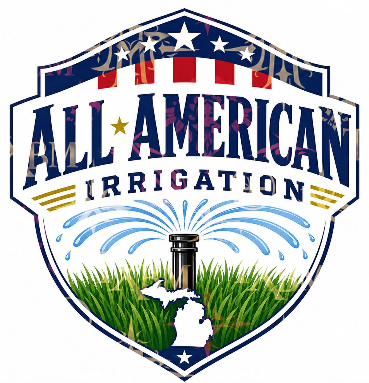
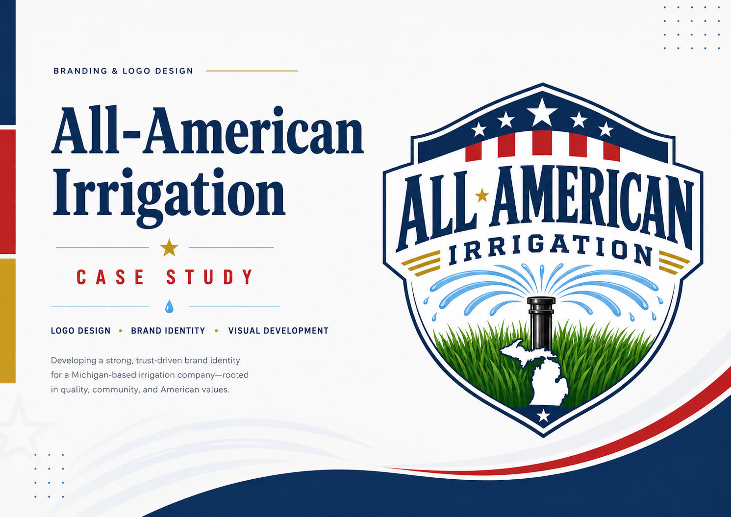
The final logo evolved into a shield-style emblem, giving the brand a confident, established look. A sprinkler head sits at the center with water spraying outward, supported by fresh green grass to clearly represent irrigation and lawn care. The Michigan silhouette adds a local, personal connection.
The final logo evolved into a shield-style emblem, giving the brand a confident, established look. A sprinkler head sits at the center with water spraying outward, supported by fresh green grass to clearly represent irrigation and lawn care. The Michigan silhouette adds a local, personal connection.