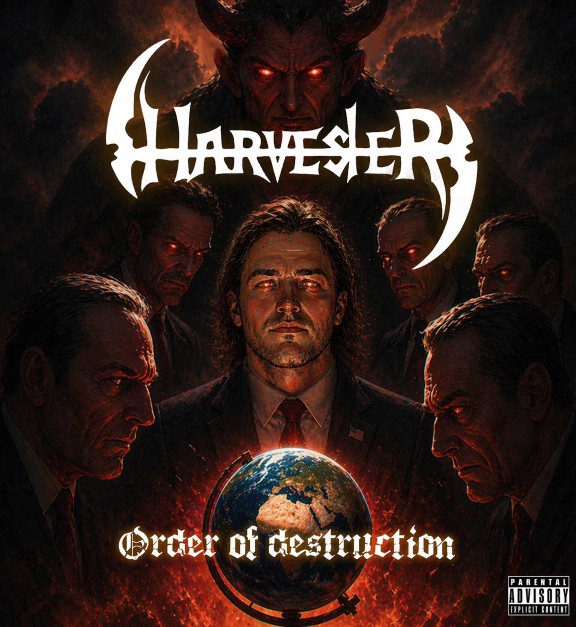
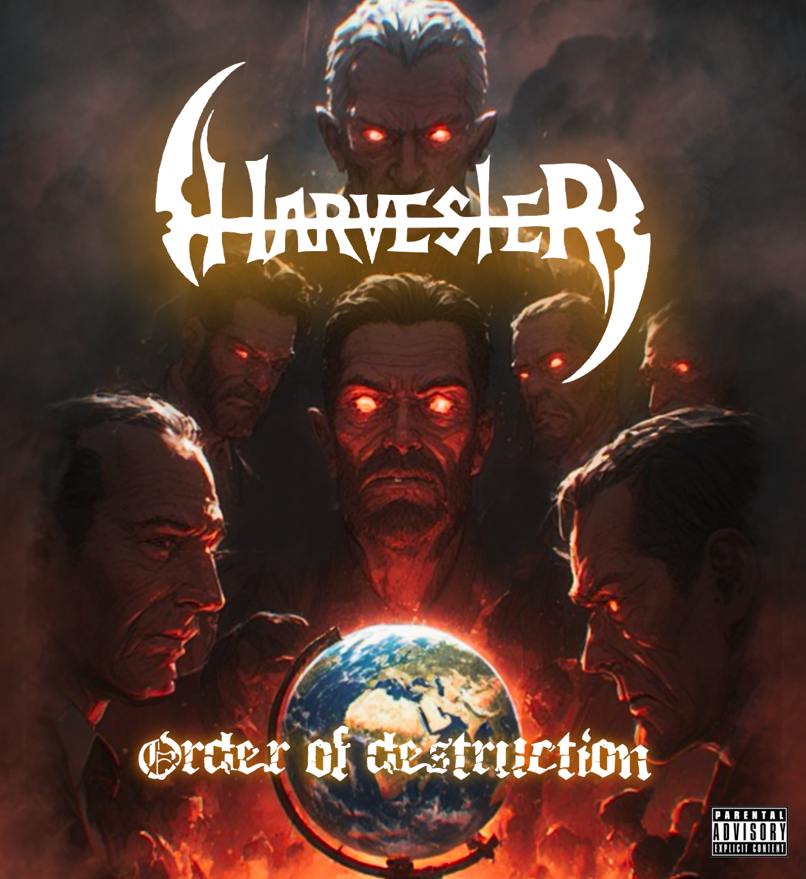
the goal was to create a cover that felt like a visual warning: a world being watched, judged, and consumed by a hidden order. Through a combination of hand-drawn concept work, dark cinematic painting, blackletter typography, and high-contrast metal logo design, the final cover delivers a complete visual identity suited for a heavy, aggressive release.
The core concept was to show destruction not as chaos, but as something organized and intentional. The globe becomes the focal point: a symbol of power, control, and vulnerability. Around it, the surrounding figures form a council-like composition, suggesting that the world is being judged, manipulated, or consumed.
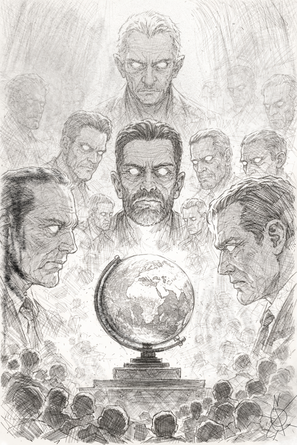
The early sketch establishes the main visual structure:
A globe centered in the lower third
Large faces framing the composition from both sides
A dominant figure above the group
Smaller crowd silhouettes at the bottom to create scale
Smoke, texture, and crosshatching to build tension
This sketch phase focused on hierarchy and mood before color or typography were introduced.
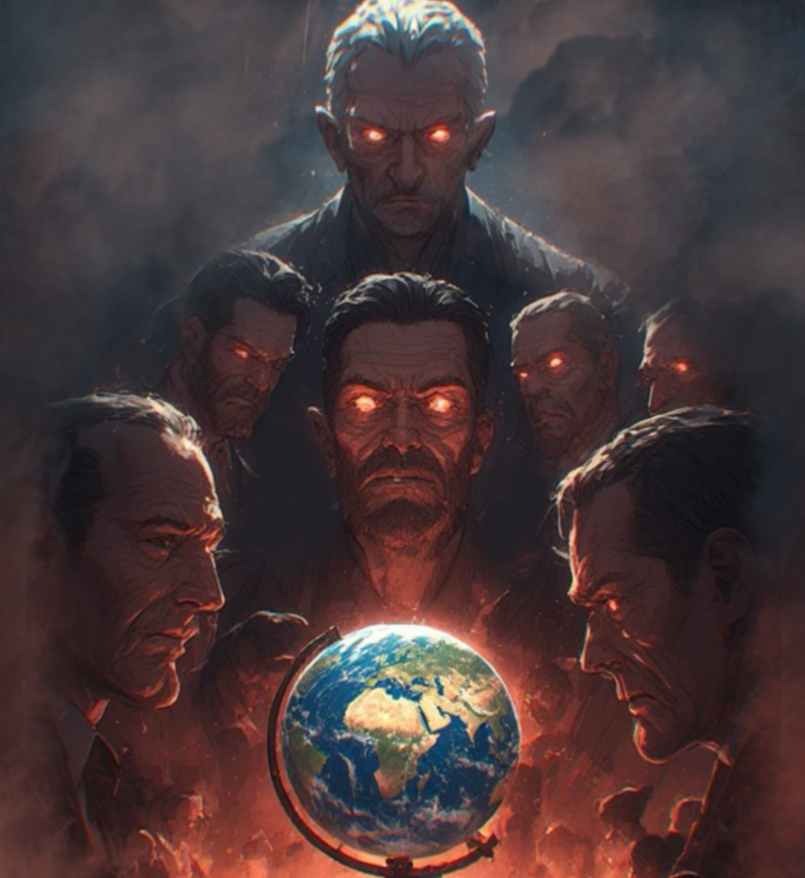
The final composition uses a triangular structure. The top figure acts as the visual peak, the central figure pulls attention into the middle, and the globe anchors the bottom of the design. This creates a strong vertical read from threat, to control, to consequence.
The glowing red eyes serve as repeated focal points throughout the piece, guiding the viewer around the cover while reinforcing the supernatural tone. The globe’s brighter blue and green tones create contrast against the otherwise red-black palette, making it feel like the last remaining source of life in the image.
The design also uses strong left-right tension. The two large profile faces on either side frame the globe, almost like opposing forces closing in on the world.
Color Palette
The palette was designed to feel infernal, smoky, and cinematic.
Color RoleDescriptionApprox. Hex
Void BlackMain background and shadow mass#080706
Charcoal SmokeAtmospheric depth and figure separation#252322
Blood RedEyes, glow, heat, danger#B3180F
Ember OrangeFirelight and underlighting#D6531E
Burnt UmberSkin shadows and smoky warmth#5B2418
Bone WhiteLogo, title, and advisory contrast#F4EFE5
Earth BlueGlobe contrast and world symbolism#1E5F7A
Faded GreenLand mass detail on globe#6F7B4A
The red-orange lighting from below gives the piece a ritualistic, hellfire quality. The cool blue globe breaks the palette just enough to make the Earth feel fragile and separate from the surrounding darkness.
Final Design
The finished cover creates a strong genre impression immediately. It reads as heavy, threatening, and cinematic while still maintaining clear hierarchy for music platforms.
The final artwork succeeds because of its balance between illustration and graphic design: the painted scene creates narrative depth, while the stark white logo and title treatment give the cover commercial clarity.
Final visual tone:
Apocalyptic, authoritarian, ritualistic, infernal, and grand in scale.
Apocalyptic, authoritarian, ritualistic, infernal, and grand in scale.