Creative Direction
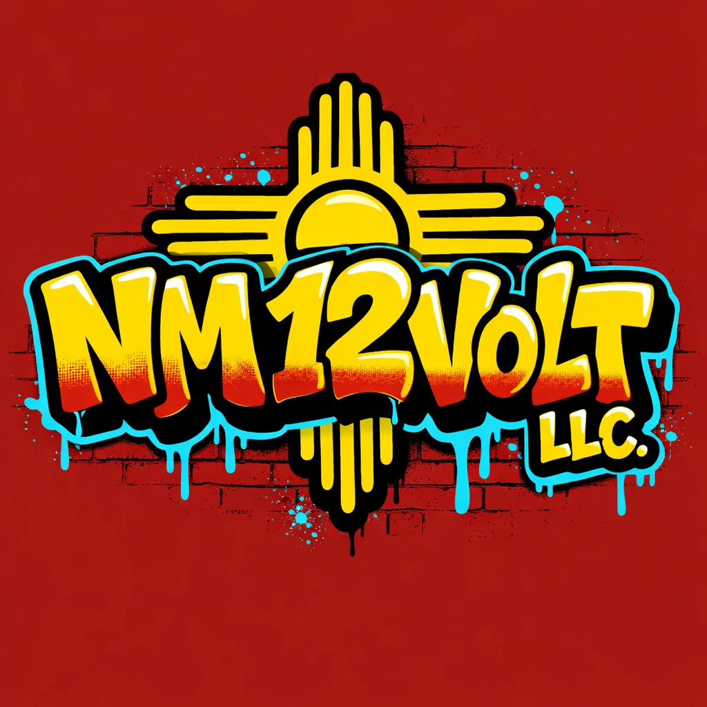
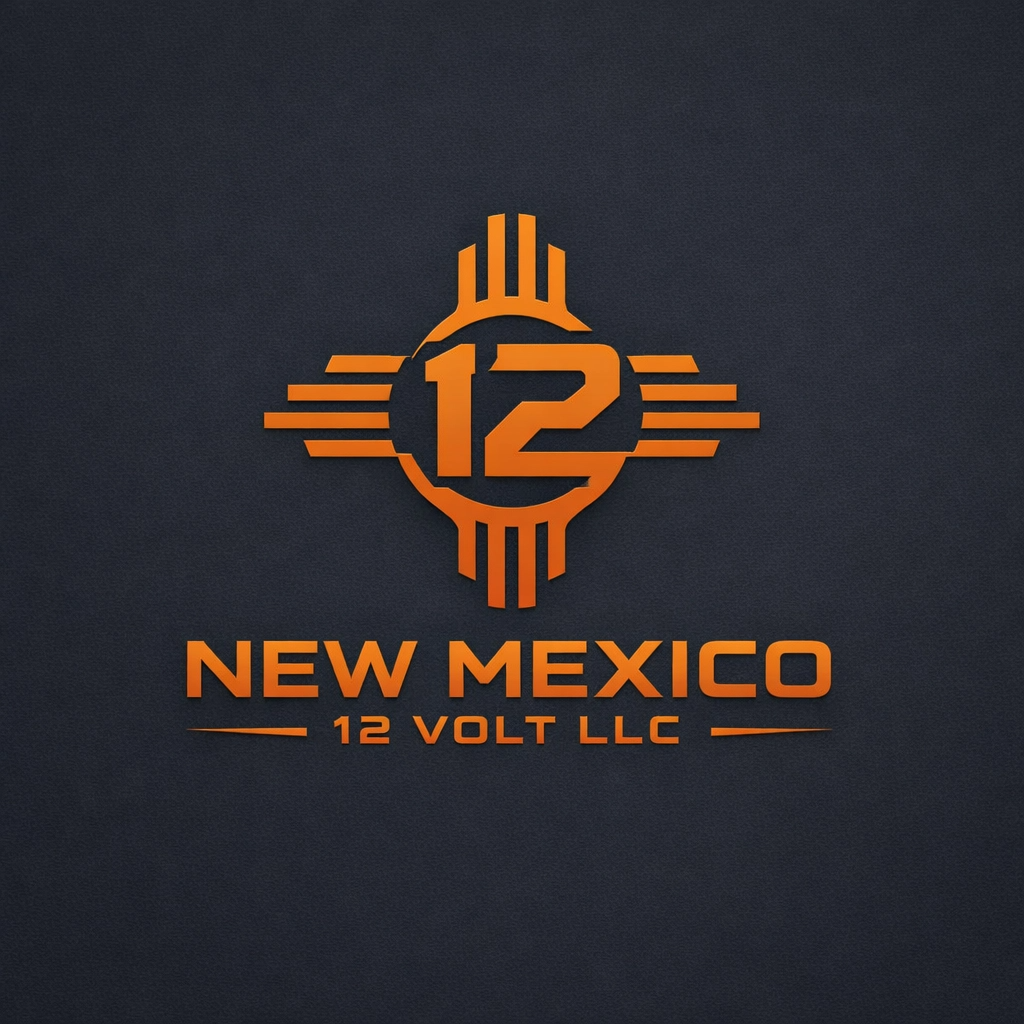
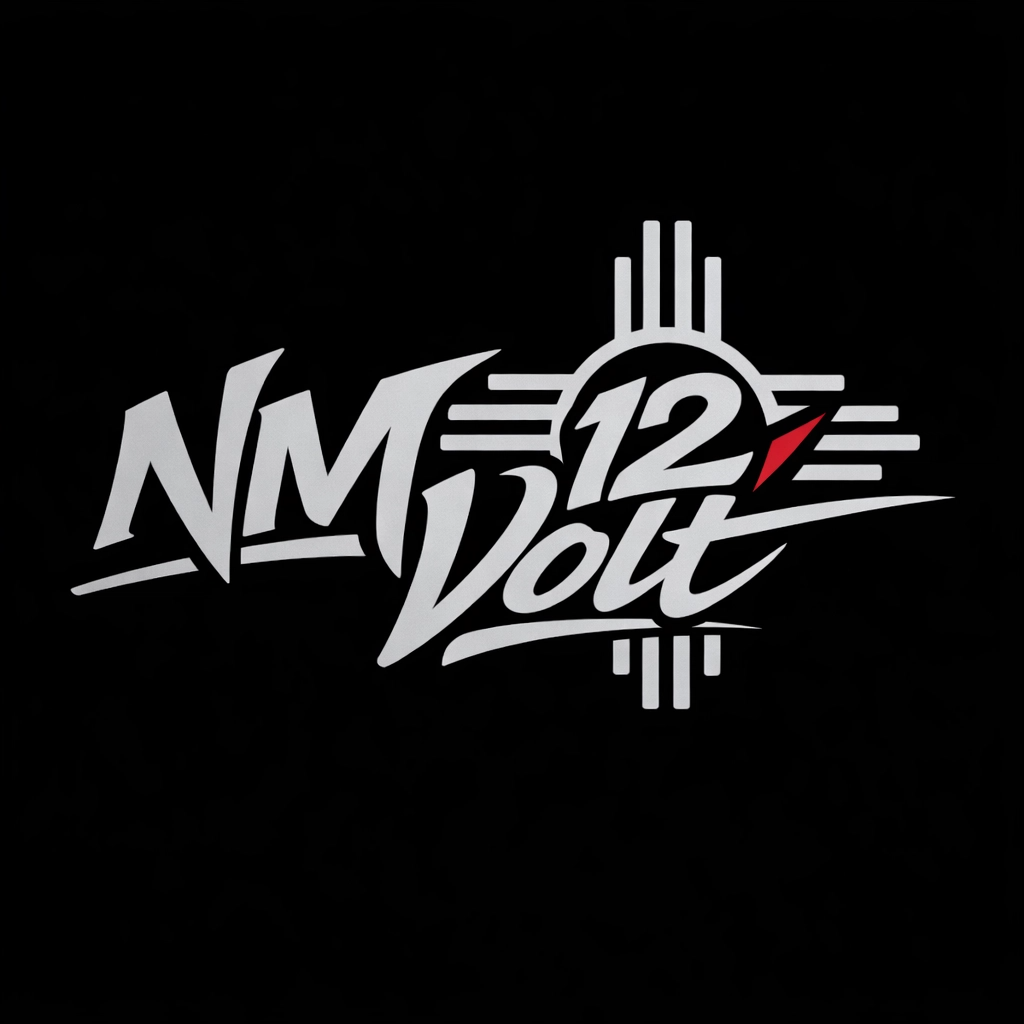
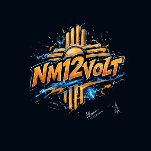
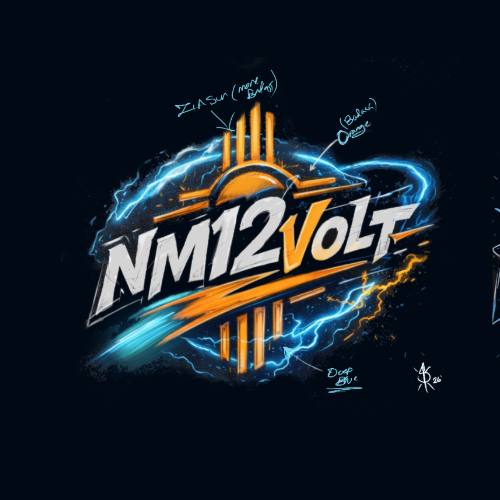
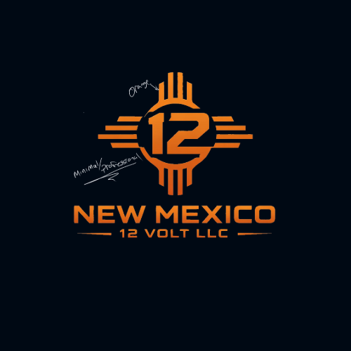
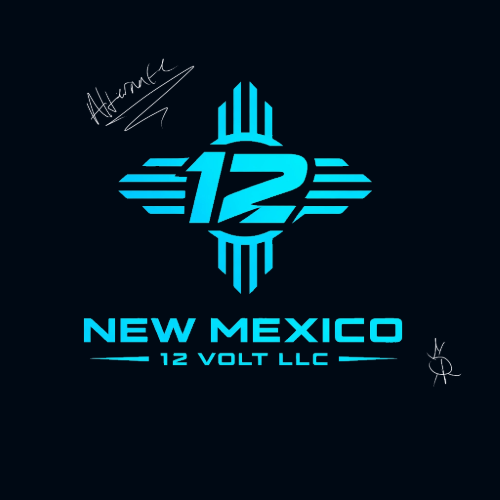
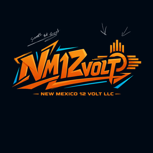
The brand needed to feel modern, fast, and technical while still having a local identity. Since the name includes “NM,” the design direction pulled from New Mexico’s visual language, especially the Zia-inspired sun shape. That symbol became a major part of the logo system, helping the brand feel regional without becoming too literal.
The overall tone was:
Bold · Electric · Automotive · Street-inspired · Modern · Local
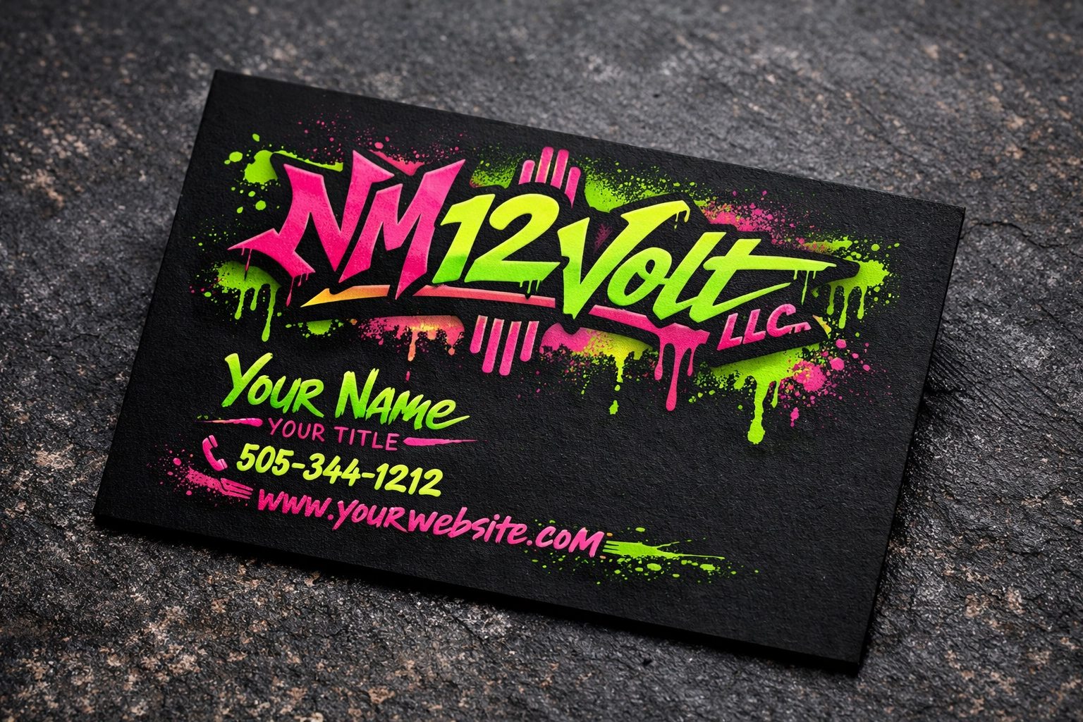
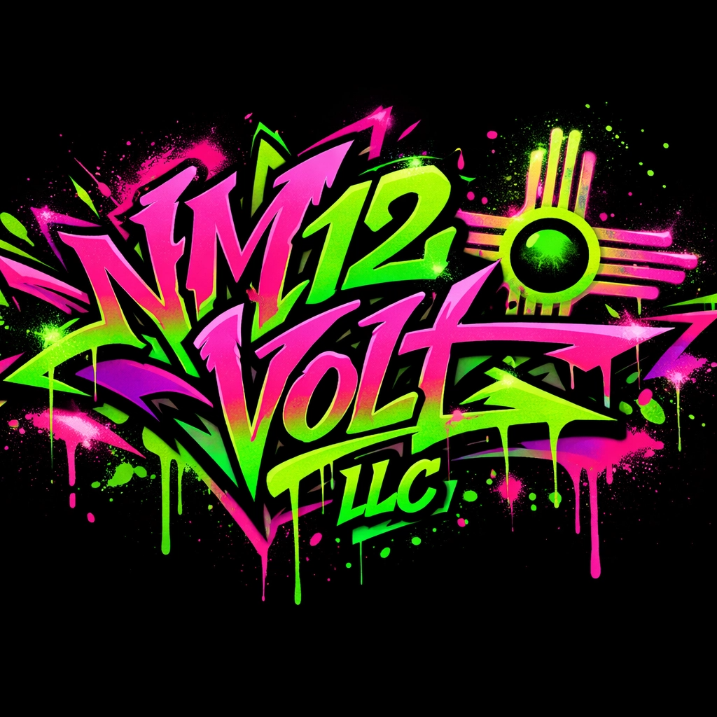
The design also needed to work in both professional and high-energy settings. That led to two connected visual directions: a clean tech-style logo and a louder graffiti-inspired version.
Color Palette
The brand uses multiple color directions depending on the application.
Core Professional Palette
ColorUseApprox. Hex
Electric CyanPrimary logo color#00D8E8
Deep CharcoalBackground / contrast#121A22
Silver WhiteLogo and text option#E8E8E8
Signal RedLightning accent#D80024
Matte BlackBusiness card base#050505