HALF-COURT CONCEPTS
A reimagining of NBA Logos:VOL1
OVERVIEW
This is a personal fan concept project — no client, no brief, no budget. Just me, a design eye that won't shut off, and a deep frustration with how some of the most storied franchises in basketball have been sitting on visual identities that either play it too safe or haven't evolved with the brand.
I picked six teams. I studied their current marks. Then I designed what I actually think they should look like — each one built around a concept direction, a full color system, typography, textures, and real application previews. This isn't a portfolio filler. This is how I think.
All work is unofficial fan concept art. No affiliation with the NBA, Nike, or any franchise. All team names and marks belong to their respective organizations.
— Texas Blood Money Media
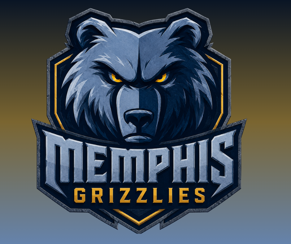
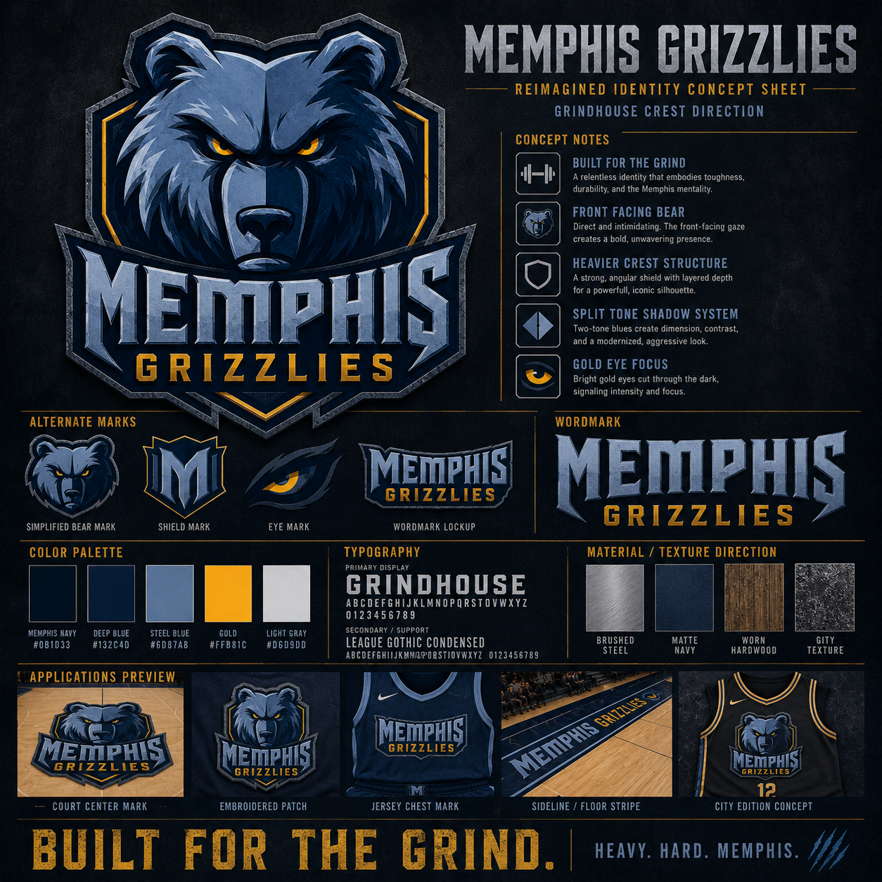
MEMPHIS GRIZZLIES
The Grizzlies already have one of the better foundations in the league.
But better doesn’t mean finished.
This concept pushes the bear into something heavier. More grit. More pressure. More Memphis.
The mark leans into the Grindhouse energy. Tougher structure, sharper attitude, darker weight, and just enough chaos to make it feel alive.
Navy, steel, smoke, ice blue, and that dirty Memphis edge.
Not a cartoon bear.
Not a soft mascot.
A franchise identity with claws.
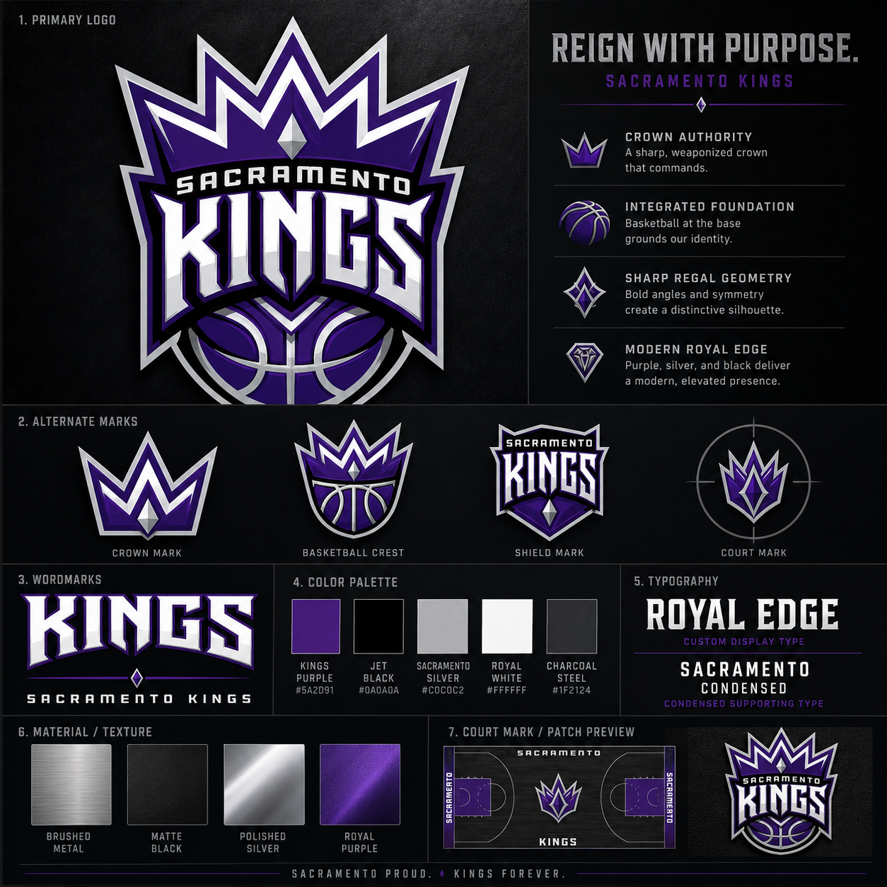
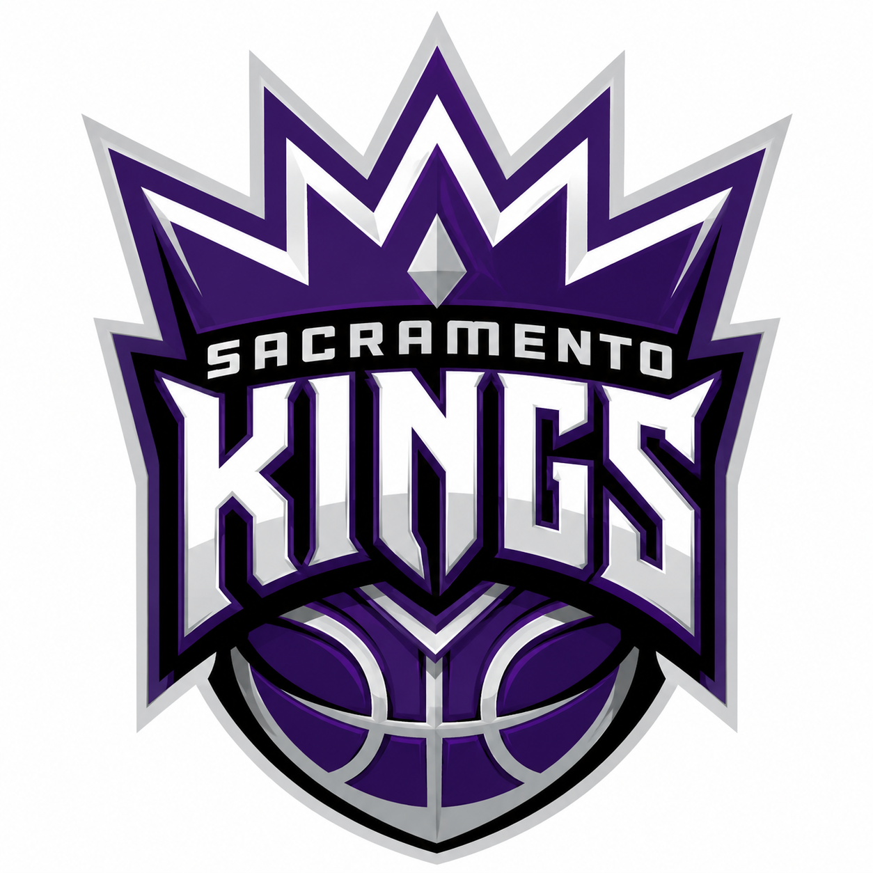
SACRAMENTO KINGS
The Kings should never look harmless.
This is royalty, pressure, history, and violence wrapped into one name. So the identity needed more weight behind it.
I pushed the crown harder, built the mark with more structure, and made the whole thing feel less like a sports logo trying to be clean and more like a damn crest.
Purple. Black. Silver. Crown energy. Court presence.
Not cute. Not soft. Not overdesigned.
Just Sacramento looking like it finally remembered it’s called the Kings.
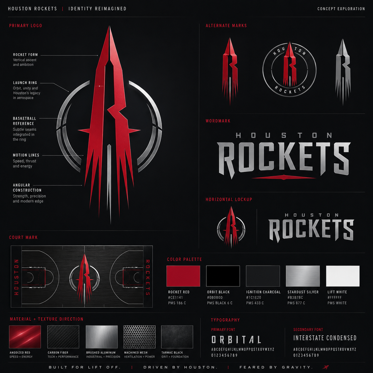
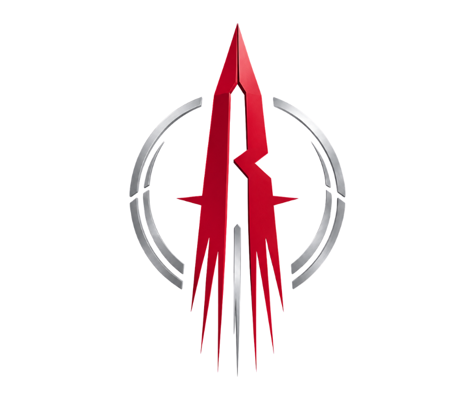
HOUSTON ROCKETS
The current Rockets identity is weak as f*** for a franchise with this much history behind it.
Houston isn’t just “space themed.” Houston helped launch put us on the f*****g moon. The logo should feel like ambition, pressure, velocity, and lift off.
So this one gets put into orbit a bit.
An angular R built like a rocket launching upward. Motion lines for speed. A launch ring for orbit. Subtle basketball seams so it still belongs on the court and not just on a NASA coffee mug.
Rocket Red. Orbital/obsidian Black. Charcoal. Silver. No cheap space gimmicks(minus the rocket, haha). No clipart rocket bullshit.
Just Houston with some actual thrust behind it.
H-town, Baby!!
It’s ignition.
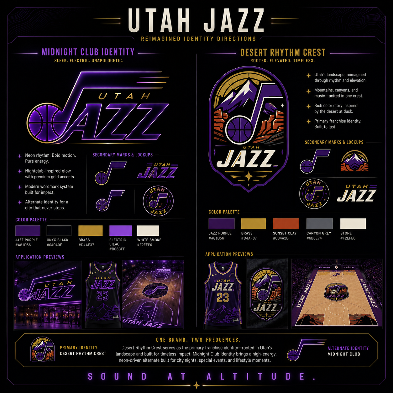
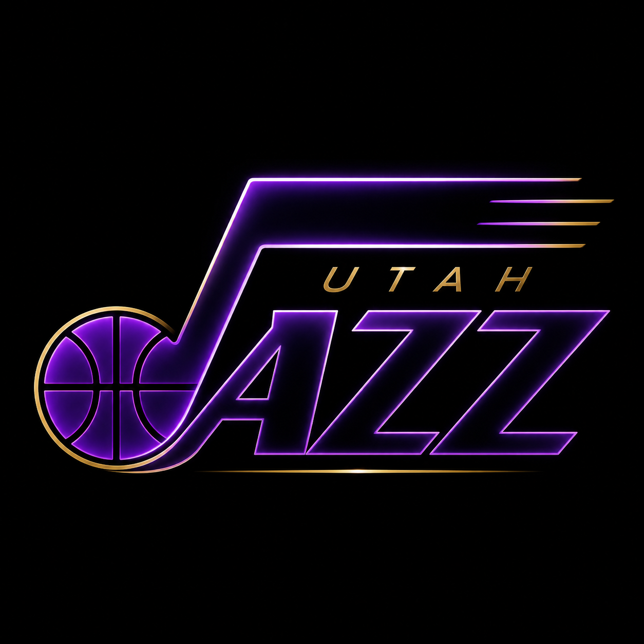
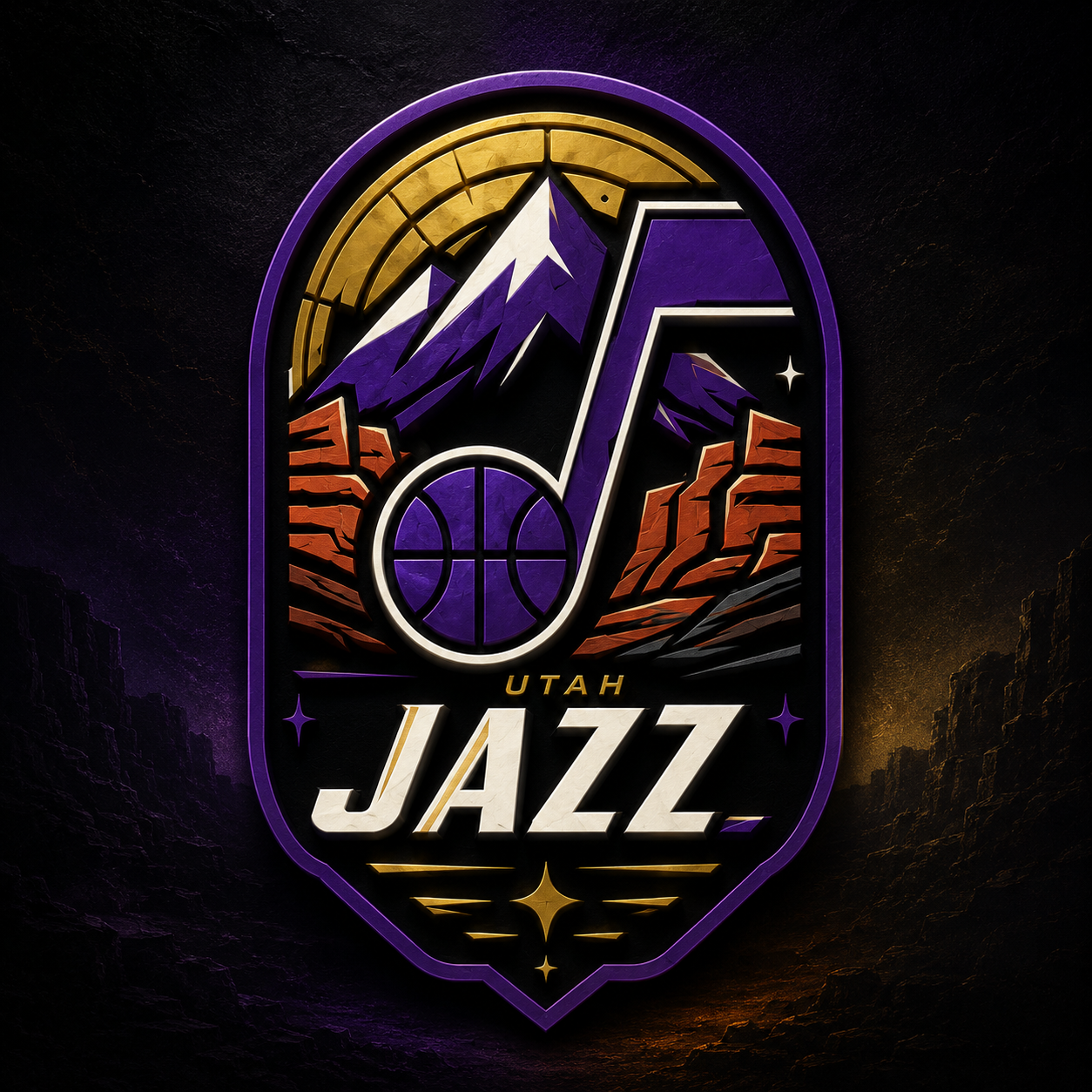
Utah’s had some solid identities over the years and still found a way to feel confused as hell. The current mark isn’t bad, it just doesn’t fully stand on anything.
So I pushed it in two clear directions.
Desert Rhythm Crest is the main identity. Mountains, canyons, desert dusk, and the note mark all tied together into something that finally feels like Utah. Jazz Purple, brass, clay, canyon grey, stone..
Midnight Jazz Club is the alternate. Dark, electric, clean, and built for night games. Purple glow, onyx black, gold accents. Less heritage, more energy.
One franchise. Two Frequencies
One franchise. Two Frequencies
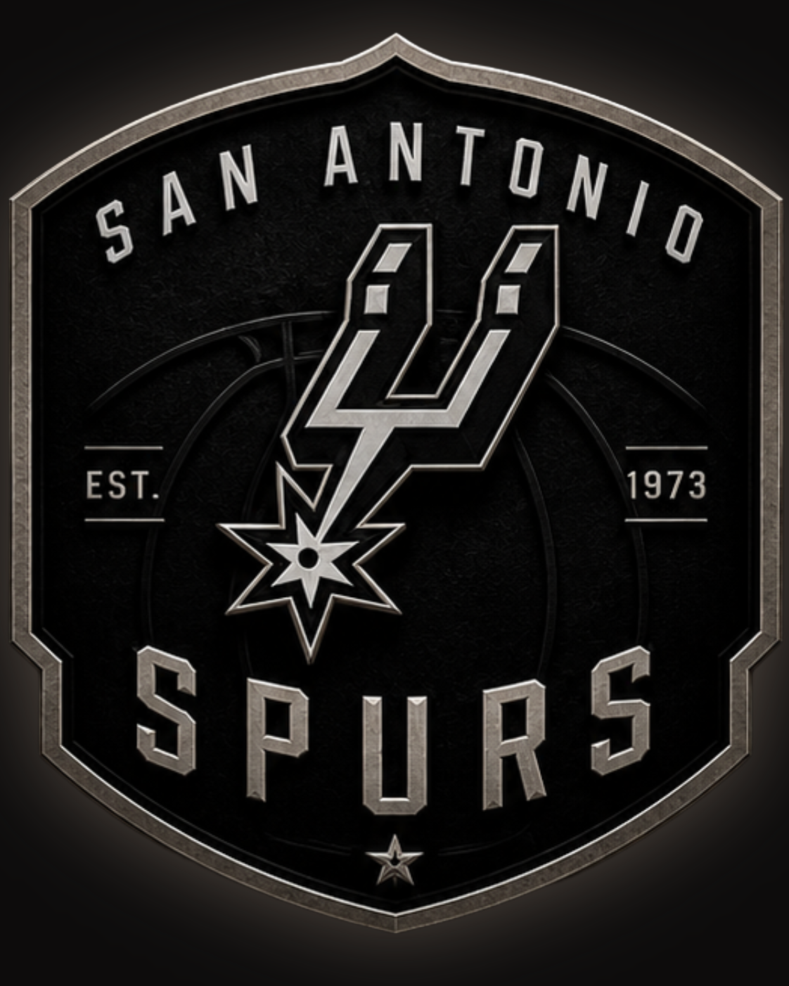
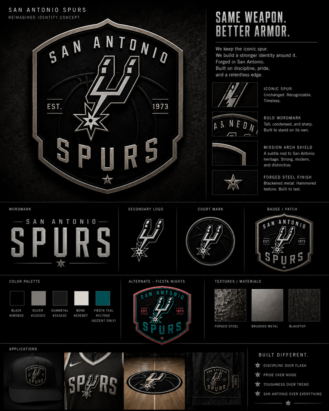
SAN ANTONIO SPURS
Same weapon. Better armor.
This one wasn’t about fixing the spur. You don’t touch that mark. It’s earned its place.
So I kept it intact and built the armor around it.
Mission arch shield. Forged steel texture. Black, silver, gunmetal, bone.
EST. 1973 stamped in like it belongs there.
Just San Antonio with more weight behind it. I think so anyway...
EST. 1973 stamped in like it belongs there.
Just San Antonio with more weight behind it. I think so anyway...
— CLOSING STATEMENT —
Six teams. Six concepts. More to come. Zero client approval needed.
This is the kind of work I do because I get fucking bored and after 2 years of doing this the process starts in my head whether I want it to or not.
— concept direction, primary marks, alternate marks, color palettes, typography, material and texture direction, and application previews.
— concept direction, primary marks, alternate marks, color palettes, typography, material and texture direction, and application previews.
Texas Blood Money Media
Different By Design. Defiant By Nature
Open for projects. Reach out.