Rituals Tattoo Society — Logo Case Study
Project Overview
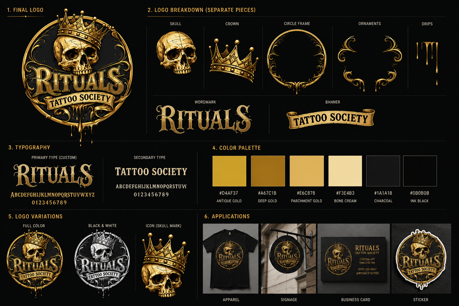
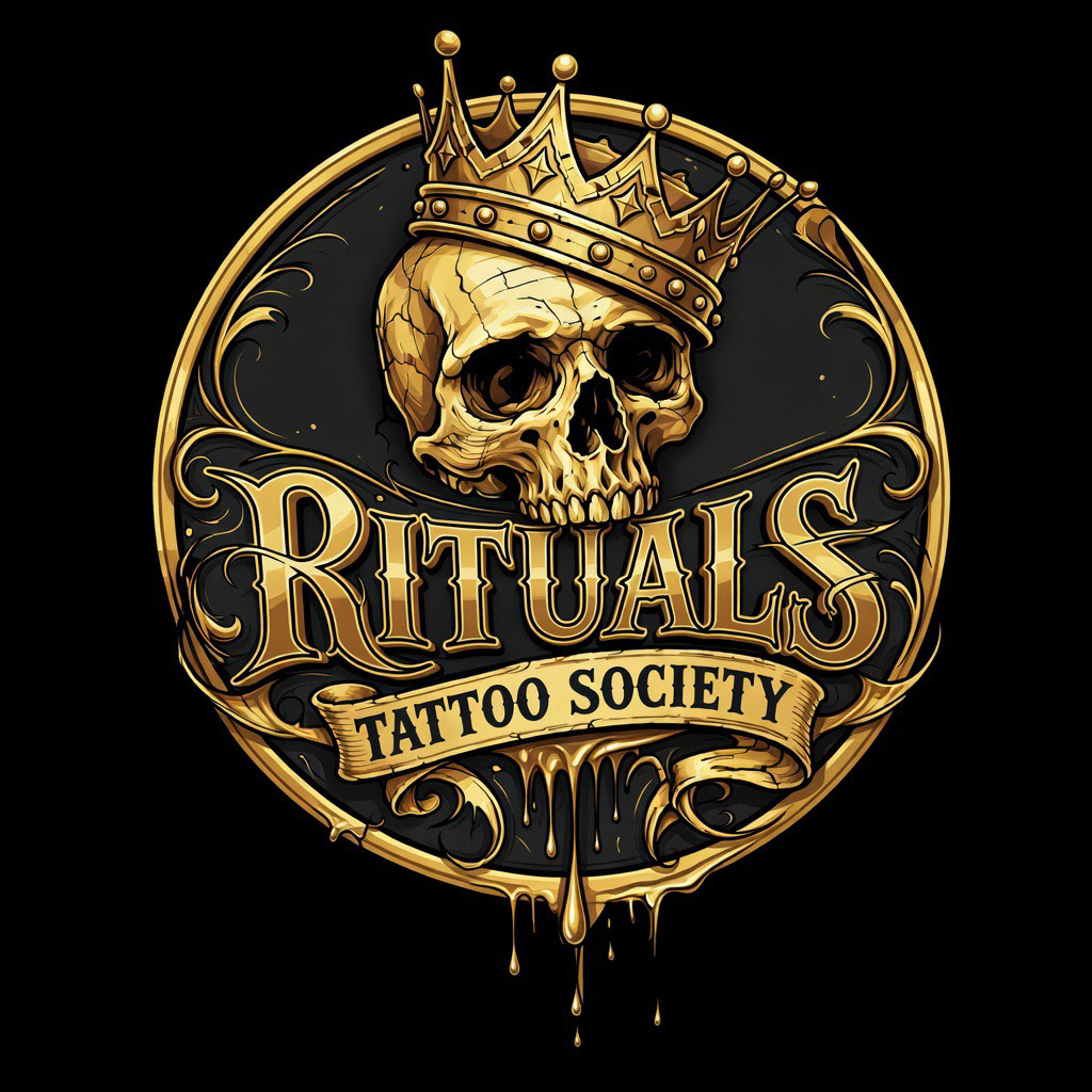
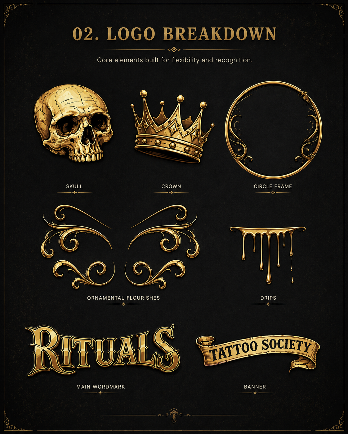
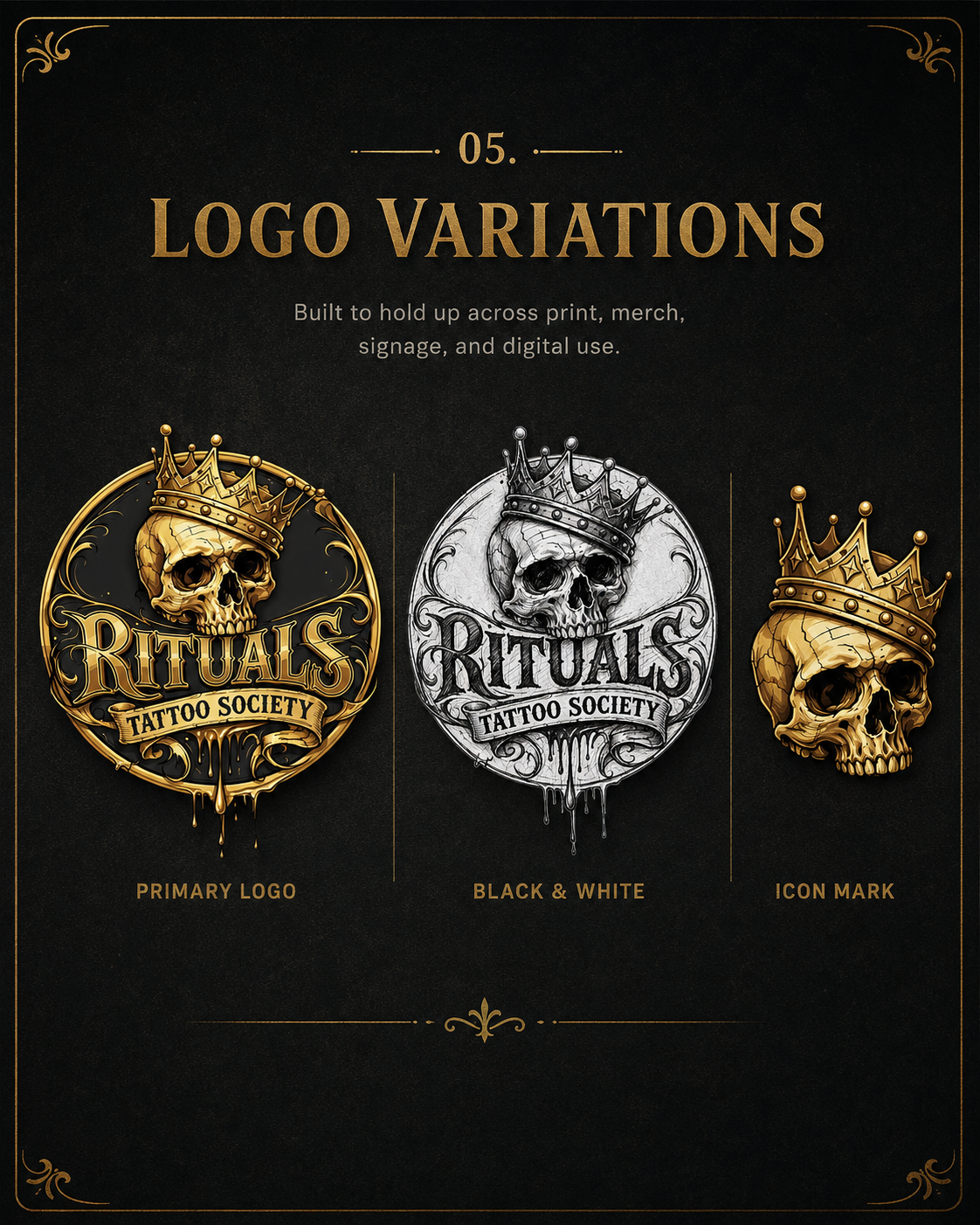
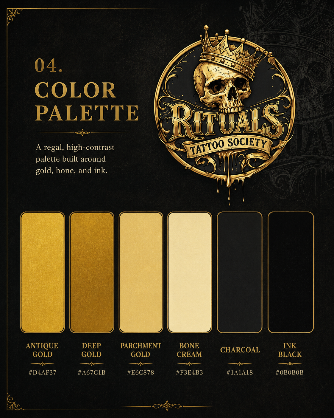
Rituals Tattoo Society is a tattoo brand identity built around tradition, legacy, and dark ornamental storytelling. The logo combines a crowned skull, custom gothic lettering, scrollwork, and ink-drip details to create a mark that feels premium, rebellious, and rooted in tattoo culture.
Design Process
The identity started as a loose black-and-white sketch to establish composition, balance, and hierarchy. The skull and crown became the main focal point, while the wordmark anchored the center of the badge. The ribbon was added to separate the secondary text and improve readability.
From there, the artwork was refined with stronger outlines, cleaner curves, more dimensional shading, and a metallic gold finish.
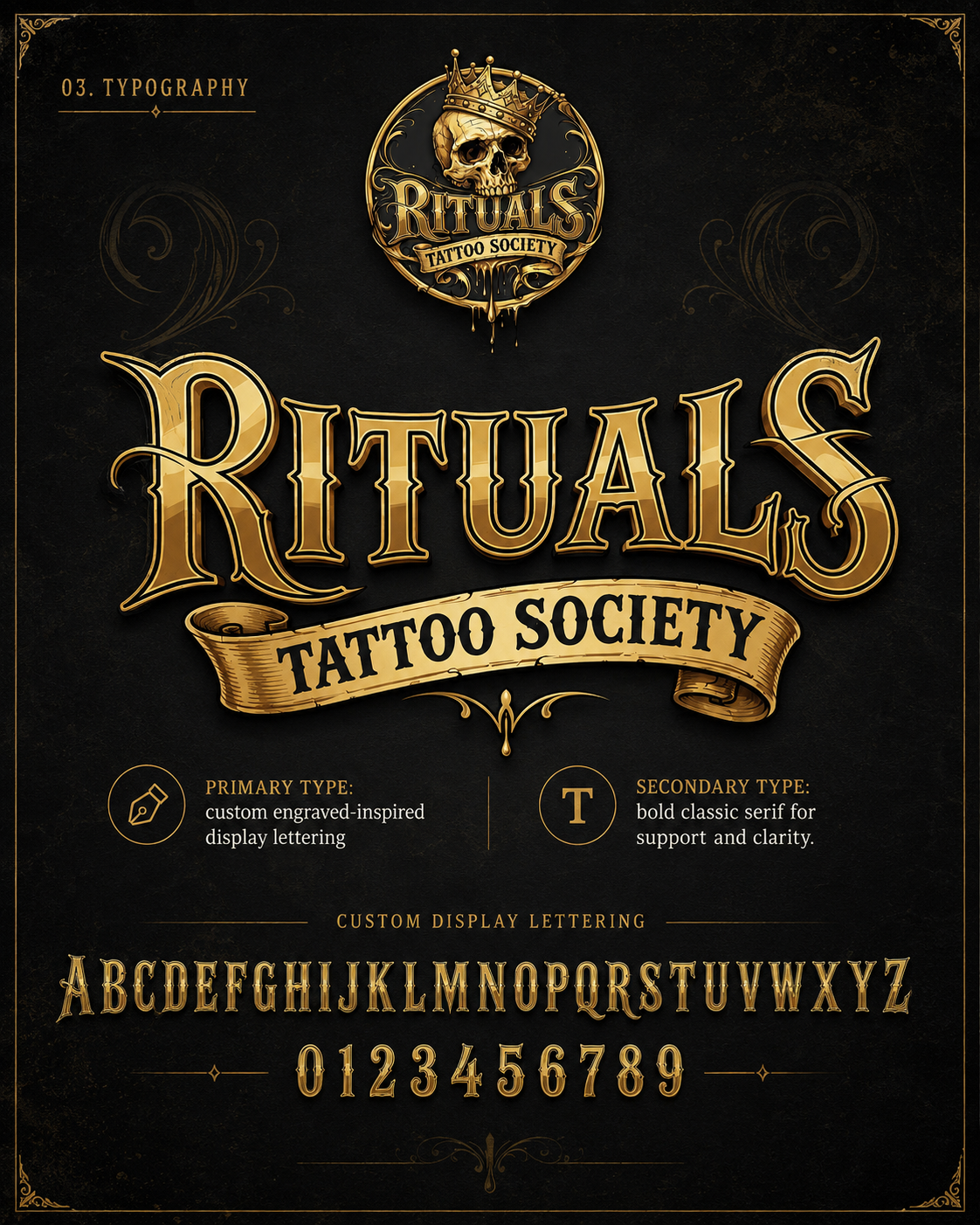
Typography
The main “Rituals” lettering uses a custom serif style inspired by vintage tattoo flash, gothic signage, and engraved display type. Sharp terminals and exaggerated curves give it a handcrafted identity.
The secondary “Tattoo Society” text uses a simpler condensed serif style to stay readable inside the banner and support the main wordmark without competing with it.