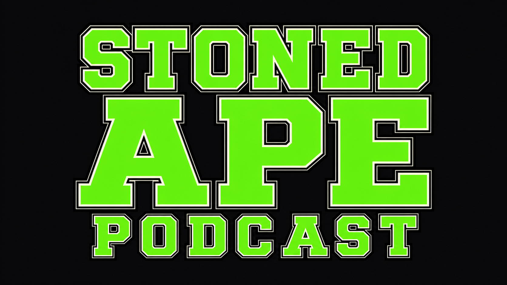
Stoned Ape is a cannabis‑adjacent, counterculture podcast that lives or dies on whether people even notice it in a sea of tiny thumbnails. I treated this project as a full identity exercise: build a mascot‑first system that can smash on podcast covers, YouTube, IG, and merch without turning into generic weed meme graphics.
I owned everything visual: mascot development, logo and wordmark system, color strategy, typography hierarchy, and rollout concepts for social and merchandise.
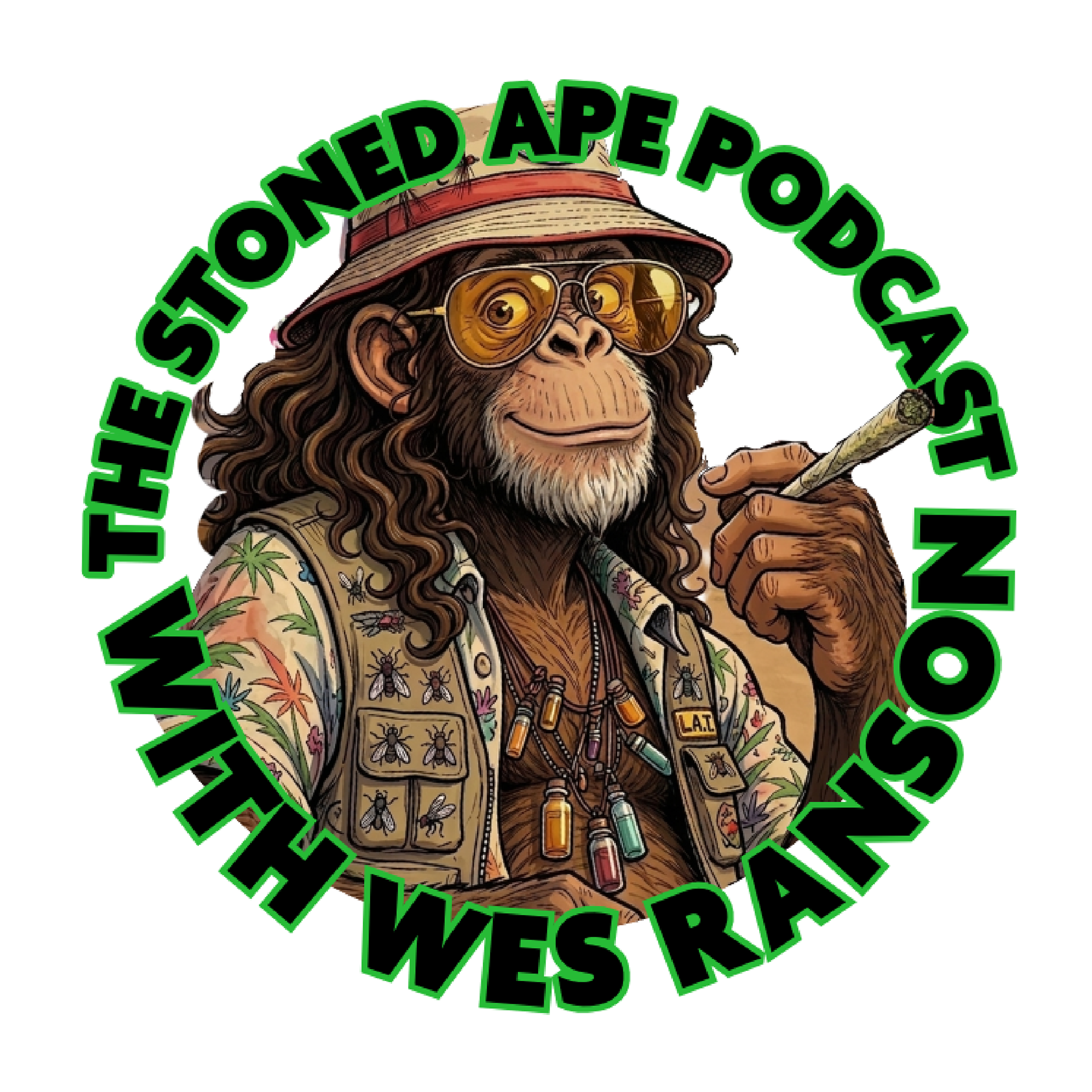
Objective
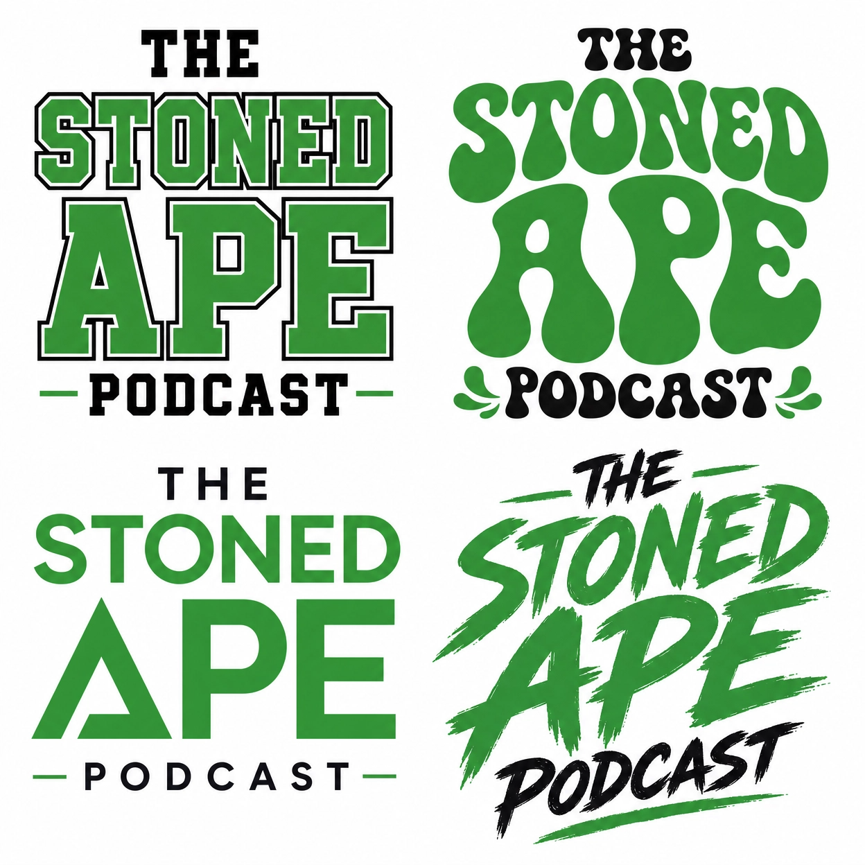
Make “Stoned Ape” instantly recognizable at a glance, readable at thumbnail size, and commercial enough to sell shirts and stickers without sanding off the weirdness.
Make “Stoned Ape” instantly recognizable at a glance, readable at thumbnail size, and commercial enough to sell shirts and stickers without sanding off the weirdness.
Mascot Development
Approach
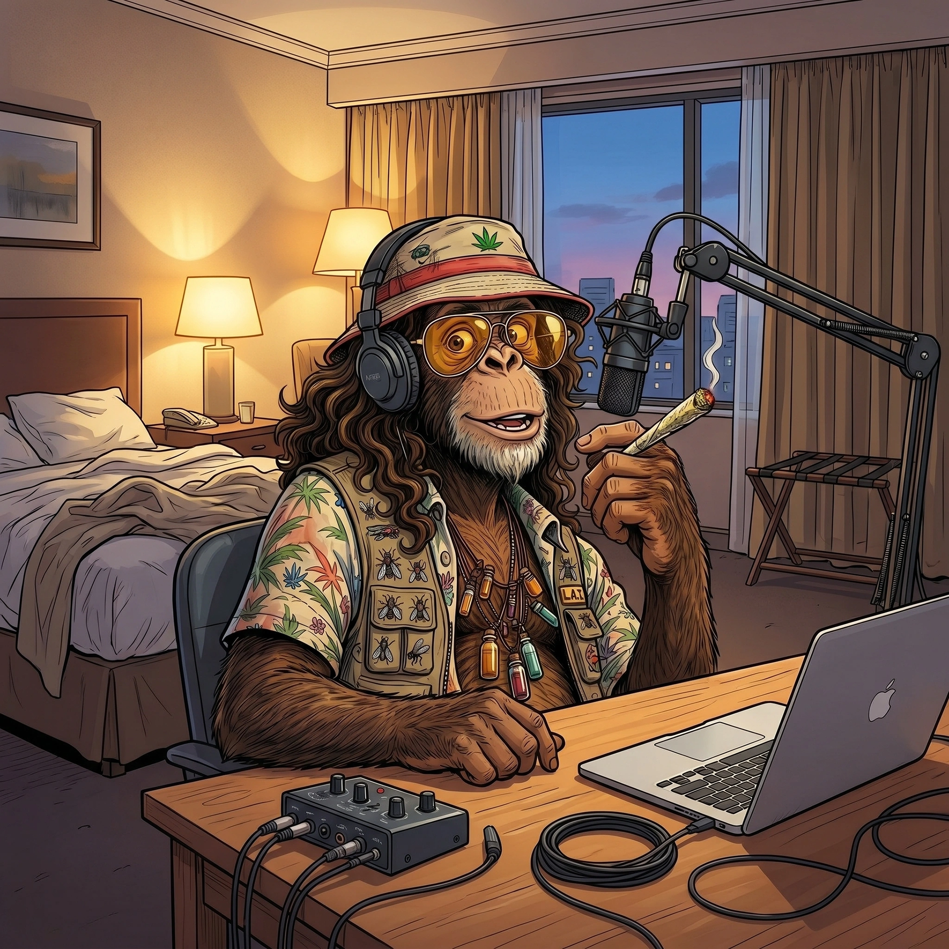
I treated the ape like a real character build, not just a single illustration. The process went from silhouette → rough line → detailed ink, so the character reads even as a solid shape.
I treated the ape like a real character build, not just a single illustration. The process went from silhouette → rough line → detailed ink, so the character reads even as a solid shape.
Design logic
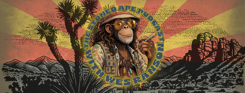
The silhouette is long‑haired, bucket‑hat, and unmistakably human‑meets‑ape. If you only see the outline, you still get the vibe.
The line work adds attitude: joint, accessories, and facial expression push it away from “cartoon monkey” and into “fried psychonaut guide.”
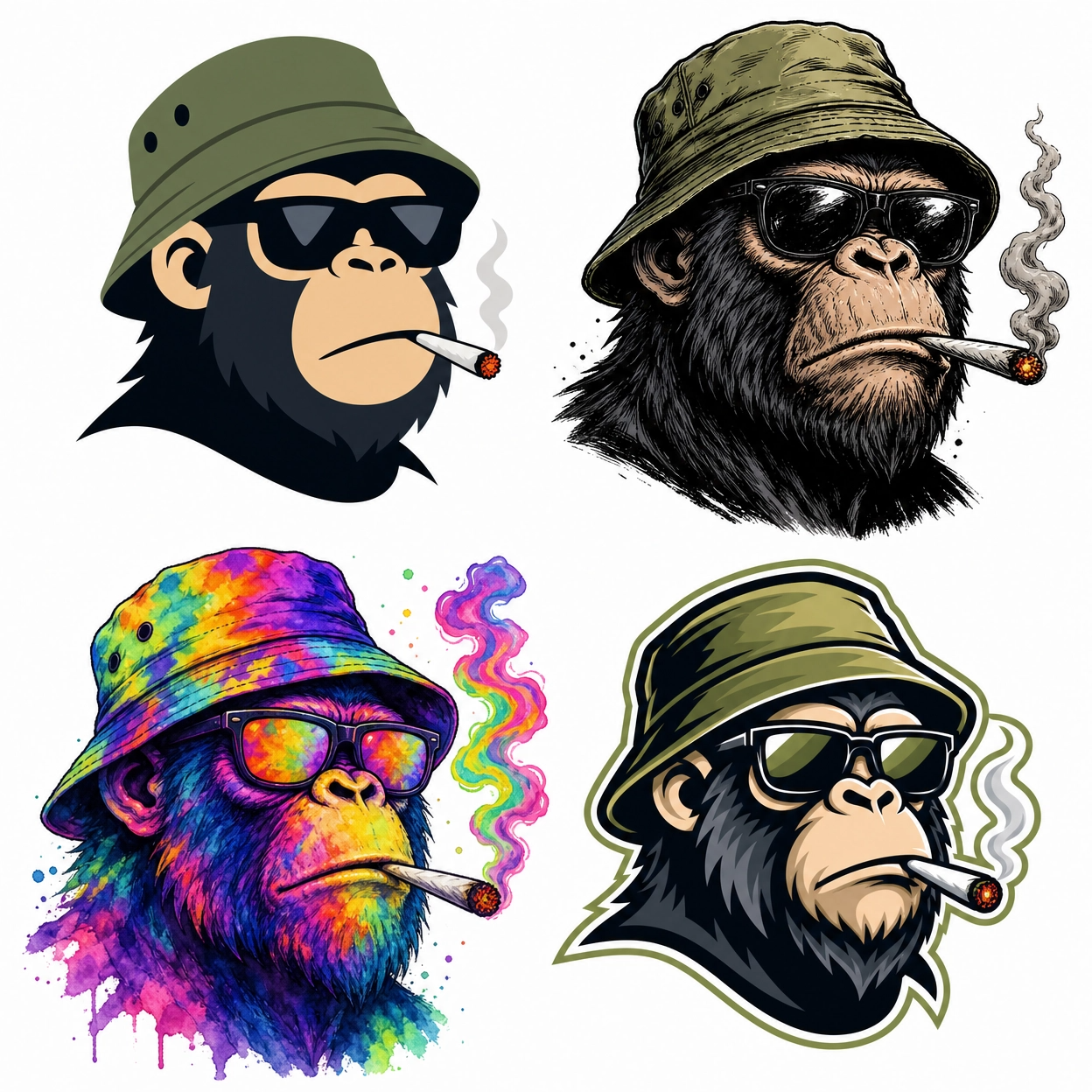
The detailed inked version is the hero illustration. From that, I can derive a simplified head mark and a one‑color silhouette version for patches, embroidery, and small icons.
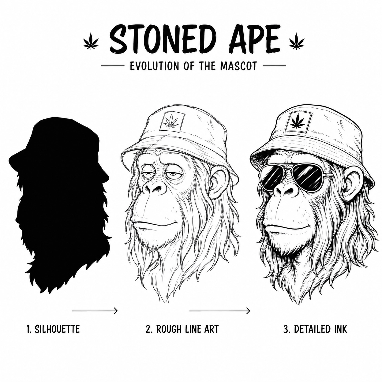
Why it matters
A lot of “mascot” brands die the second you try to print them small. This process lets the Stoned Ape character survive as:
A lot of “mascot” brands die the second you try to print them small. This process lets the Stoned Ape character survive as:
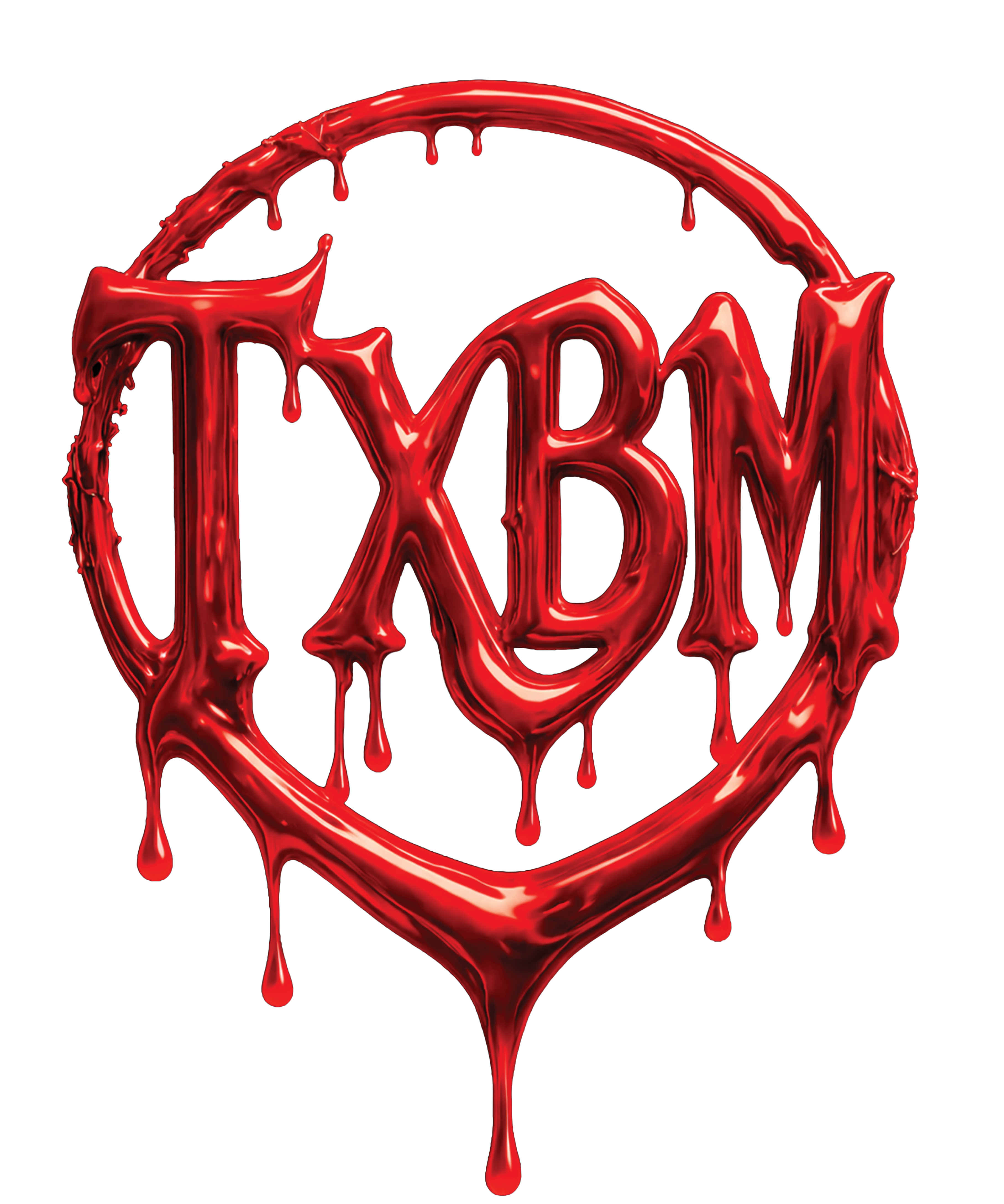
Full illustration (covers, posters).
Simple bust/head (social avatars, badges).
Flat silhouette (tiny icons, stamps, neck labels).
Where I tested it
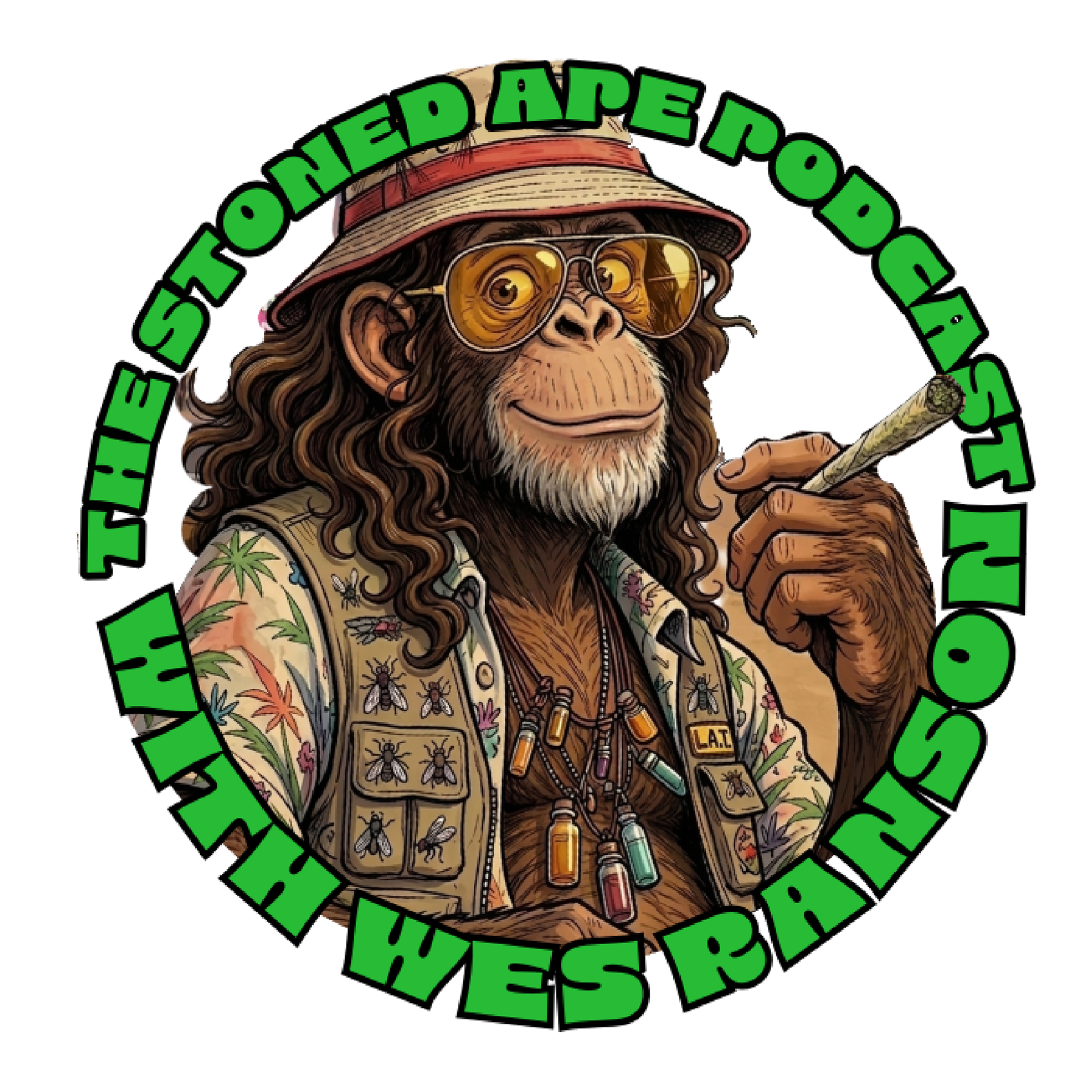
To prove the system isn’t just pretty in Figma, I mocked the identity in the actual formats it needs to live in:
To prove the system isn’t just pretty in Figma, I mocked the identity in the actual formats it needs to live in:
Spotify / Apple podcast cover art.
YouTube episode thumbnail template with space for guest photos and titles.
Instagram feed/promotional tile.
T‑shirt graphic and circular patch/sticker.
Simple website or landing hero.
The point is simple: if the brand falls apart when you put it on a shirt or inside a YouTube frame, the identity isn’t done.